About Mike Brothers
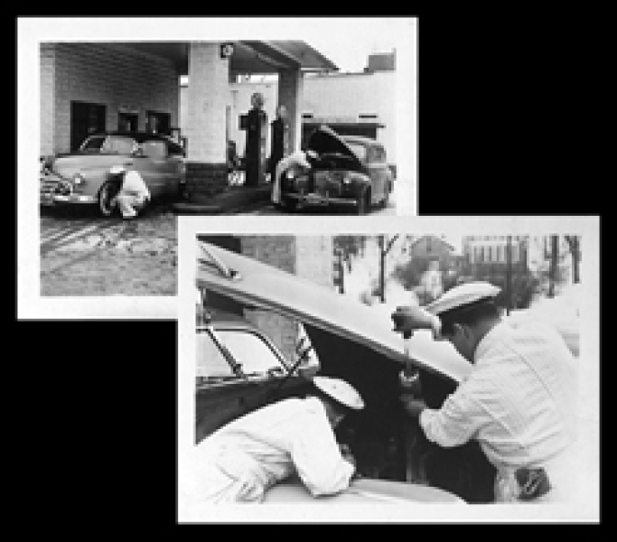
Inspired by the original Mike Brothers, which was a family run Midwest full-service gas station established in the late 1940’s, where many business and life lessons of hard work, customer service and quality laid a solid foundation for the current day Mike Brothers Emblematic Solutions.
We honor the Mike Brothers legacy by applying that experience to our products and service today.
We can create the solution for every opportunity
With over 25 years of industry experience, Mike Brothers Emblematic Solutions has the experience to create lasting products for any program or event:
- Employee Recognition Programs
- Years of Service
- Safety Awards
- Volunteer Events
- Awareness Products
Logo Concept History
The history of Mike Brothers is deeply rooted in the automotive industry, so creating a brand that puts that experience and vision at the center of the company was extremely important to us.
Here’s our logo concept break down:
- The circle around the MB letters is a tire that depicts the importance of constantly revolving innovation for fresh ideas and new products
- The "V" in our logo symbolizes the strength of a V8 engine which is ingrained in the core of our business and work ethic.
- The two-prong color scheme stands for our Midwest neighborhood community sports league and high school colors, which keeps us humble and proud of our roots, reminding us how far we have come with the help of our family and community.
- MB stands for Mike Brothers!
![]()
![]()
![]()
![]()
![]()